9 Call to Action Examples That Convert Marketing Leads
The AI CMO team
Oct 19, 2026
Popular CTA advice often starts with stronger verbs, brighter buttons, and more urgency. Those tactics can attract attention, but attention isn't the same as incremental revenue. A “Download now” button can fill a database with people who never become customers, and a discount-driven cart reminder can subsidize a purchase that would have happened anyway.
A strong call to action is a business decision. It defines the next customer action, sets expectations about effort and risk, and determines which signal will show whether the campaign worked. The best call to action examples match the action to the buyer's stage, the channel, and the journey, rather than optimizing a generic button color or click-through rate. A converting interface makes that next step clear, but the offer and measurement behind it determine whether the step creates value.
The examples below connect each CTA to its likely customer intent, the follow-up needed to move that intent forward, and a meaningful way to measure results. They also show where familiar tactics, such as lead magnets and urgency, need guardrails to avoid low-quality demand.
Table of Contents
- 1. Free Trial CTA “Start Your Free Trial”
- 2. Platform-Native Ad Buttons for Meta and LinkedIn
- 3. Double Opt-In SMS CTA “Reply YES to Confirm”
- 4. Gated Lead Magnet CTA “Download the Playbook”
- 5. Demo Request CTA “Book a Demo”
- 6. Abandoned Cart CTA “Complete Your Order”
- 7. Referral CTA “Give $X, Get $X”
- 8. Waitlist and Early Access CTA “Reserve Your Spot”
- 9. Social Comment-to-DM CTA “Comment [KEYWORD] for the Link”
- Comparison of 9 Call to Action Examples
- Turn Examples Into a Conversion System
1. Free Trial CTA “Start Your Free Trial”
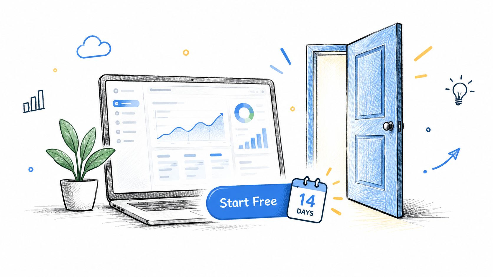
A free trial asks a prospect to try the product before making a purchase decision. That can lower perceived risk, but the button's job isn't finished when someone creates an account. The trial needs to help the user reach a meaningful first result, or the company may collect signups without building a path to revenue.
Slack's “Try for free” flow leads into workspace creation, making the next action concrete. Dropbox offers another useful SaaS pattern, with freemium access alongside trial options that let users experience storage tiers before upgrading. Both examples connect signup to product use, rather than treating a form submission as the outcome.
Practical rule: Describe the commitment beside the CTA. “Start your 14-day trial, no card required” sets clearer expectations than “Get started.” Only use that wording if the actual offer supports it.
Connect the trial to activation
Trigger onboarding when someone signs up, then tailor reminders to the actions that indicate product value. A user who hasn't completed the first key action may need guidance; a high-intent account showing meaningful usage may be ready for a sales conversation. Route those signals to the right team while the trial is active.
Measure activated trials, not just trial starts. If a nurture sequence is meant to increase paid conversion, reserve a holdout group so the team can compare what happened with and without the messages. That helps separate revenue the sequence caused from revenue that would have arrived anyway.
2. Platform-Native Ad Buttons for Meta and LinkedIn
A platform-native ad button tells people what to expect after they engage. Meta offers options such as "Learn More," "Shop Now," "Sign Up," "Book Now," "Download," "Contact Us," "Subscribe," and "Get Offer." LinkedIn offers choices including "Apply," "Download," "Get Quote," "Sign Up," "Register," "Request Demo," and "Learn More." The button should match the actual next step, not fill a design slot.
For example, a B2B software advertiser promoting a product walkthrough can pair “Request Demo” with a landing page that makes the booking step obvious. An ecommerce brand using Meta catalog ads can use “Shop Now” to send product-led traffic directly to a relevant shopping destination. If the button promises a demo but the page opens with a broad company overview, the mismatch can cost the campaign qualified prospects.
Test the whole promise
Use the same creative with different native buttons when both options fit the offer. Keep the landing page headline consistent with the selected action, then compare completed outcomes such as purchases, qualified leads, or event registrations. Click-through rate can help diagnose an ad, but it doesn't show whether the traffic generated business value.
Review performance against the campaign's own baseline and investigate weak ad sets promptly. A button that attracts more clicks may also attract people who aren't ready for the form or offer. The useful winner is the version that produces the intended downstream action without lowering lead quality.

3. Double Opt-In SMS CTA “Reply YES to Confirm”
“Reply YES to confirm” turns a phone-number submission into an explicit confirmation step. For a retailer collecting SMS subscribers at checkout or in a store, that reply can help establish that the person wants messages before promotional sends begin. Event organizers can use the same pattern to confirm alert subscriptions before sending schedule updates.
The confirmation message should explain what the subscriber is signing up for. Include the expected message frequency, applicable message and data rates, and clear instructions for replying STOP to opt out and HELP for assistance. A vague prompt that collects a reply without explaining the ongoing messages may generate confusion and undermine trust.
Make consent usable in the sending system
Store the consent source, timestamp, and exact language shown to each subscriber. Apply suppression when a STOP reply arrives, so the opt-out blocks later messages across relevant journeys rather than only one campaign. The confirmation itself can deliver a useful next step, such as a promised offer or event-information link, as long as it matches the disclosure.
The role of SMS in marketing depends on more than response volume. Teams should review consent records, delivery health, and downstream customer behavior together. A growing list isn't an asset if subscribers didn't understand the offer or the send system can't reliably honor their preferences.
4. Gated Lead Magnet CTA “Download the Playbook”
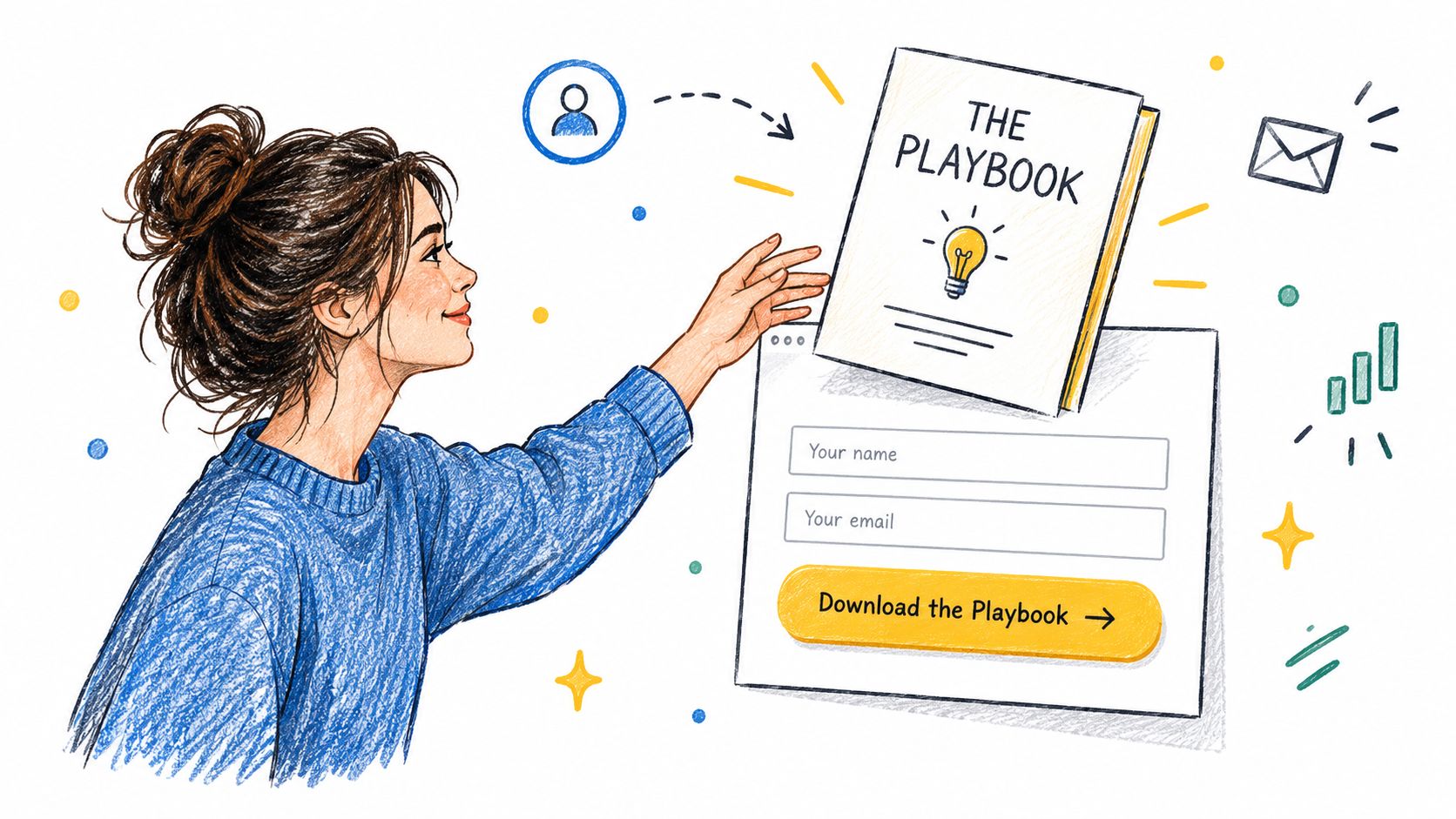
“Download the Playbook” works best when the asset solves a problem the visitor already wants to address. A specific template or benchmark can earn a prospect's attention before a sales conversation, while giving marketing a reason to continue the relationship. HubSpot's downloadable guides and templates illustrate how useful resources can support an inbound journey; B2B software companies can also use benchmark reports to explain a market problem and connect it to their product.
The trade-off is lead quality. A broad “Download the guide” offer can attract people who want the file but have no interest in the product. A clear promise, such as “Get the lead-scoring template,” helps visitors understand the value exchange and gives the team a stronger basis for relevant follow-up.
Capture less, learn over time
Keep the first form focused on the information needed to deliver the asset and begin appropriate follow-up. Collect additional context later through engagement or progressive profiling, rather than demanding a long profile before the visitor has received value. Then build a nurture path that moves from useful education to a product-specific next step.
A landing page should repeat the offer's promise, explain what information is collected, and make the download easy to access. Guidance on creating landing pages can help teams keep that path aligned from ad or article to form and asset. Judge the program by the revenue and qualified pipeline associated with the contacts, using a holdout where possible, not by download volume alone.
5. Demo Request CTA “Book a Demo”
“Book a Demo” suits buyers who need to evaluate how software fits their processes. A B2B SaaS company might place it on a pricing page, where visitors already have a reason to understand the product in more detail. Enterprise buyers may prefer a recorded walkthrough when a live meeting doesn't fit their schedule, so the CTA can offer that alternative without disguising what the next step involves.
The booking process should qualify without turning a calendar request into a lengthy application. Ask for a small set of useful details, such as business email, company, and role, then collect more context during the call or through appropriate enrichment. An embedded calendar can reduce the friction of finding a time, but it won't compensate for a vague agenda.
Send a pre-demo message that asks about the prospect's current process. The sales or solutions specialist can then prepare a relevant walkthrough instead of repeating a generic product tour. If the prospect misses the meeting, a brief follow-up journey can offer a simple way to reschedule.
Track demo-to-opportunity and opportunity-to-revenue by traffic source. Booking volume alone can reward a campaign for scheduling meetings that never become credible opportunities. A strong CTA sets up an evaluation, and the measurement should reveal whether that evaluation advances the buyer and the business.
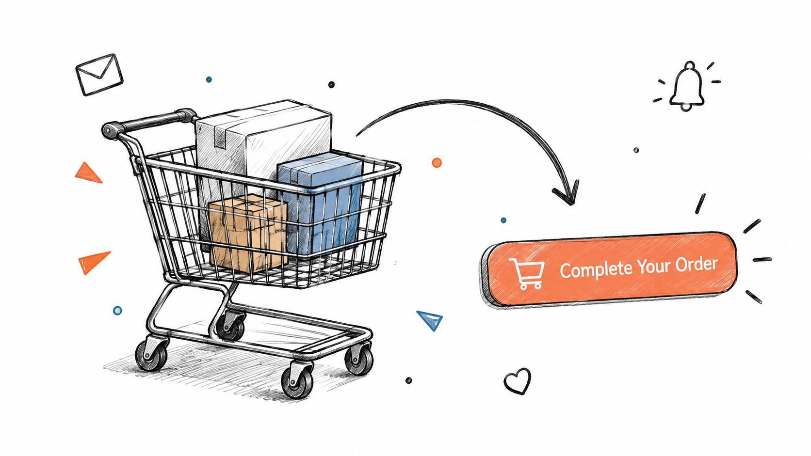
6. Abandoned Cart CTA “Complete Your Order”
“Complete Your Order” addresses a shopper who has already added products but hasn't finished checkout. A Shopify merchant can send a reminder that links back to the saved cart, while a fashion retailer might include a size guide or delivery details to resolve a likely hesitation. The message should make it easy to continue without assuming that price is the problem.
Discounting every abandoned cart can reduce margin and teach shoppers to wait for a coupon. First examine the friction the customer can resolve: shipping cost, delivery timing, returns, or uncertainty about an item. Put the relevant reassurance near the CTA and keep the route back to checkout direct.
Don't confuse recovery with incrementality. A shopper may return without a reminder, so attributed orders alone can overstate the revenue a recovery program created.
A practical program can send an initial reminder soon after abandonment and follow with limited, relevant messages over the following days. Suppress shoppers who have already purchased through another channel, and compare a recovery group with a holdout to estimate incremental revenue. The exact timing should reflect the product, buying cycle, consent, and customer expectations, rather than an automatic schedule.
For teams coordinating this with broader customer recovery work, a customer winback campaign tool can support the operational planning. The key measure remains incremental recovered revenue, with margin and customer experience included in the decision.
7. Referral CTA “Give $X, Get $X”
“Give $X, Get $X” makes the referral exchange understandable at a glance. A subscription business can offer account credit after a referred friend signs up and pays, while the new customer receives a matching benefit. Dropbox's early referral program used extra storage for both the existing user and the new user, tying the reward to a product benefit rather than a generic cash incentive.
The best moment to show a referral prompt is after the customer has experienced a result worth sharing. A successful first outcome or a positive review can create a more credible invitation than an interruption during onboarding. The CTA should explain when rewards are granted, what counts as a qualifying referral, and any relevant limits.
Protect the economics
Set rules for self-referrals and duplicate accounts, and review reward cost against the value of acquired customers. Segmenting by customer value and churn risk can help teams avoid spending incentives where they won't change behavior or where they could reward a customer who was already likely to refer.
Measure referred customers on retention and margin, not just the number of invitations or signups. Compare that performance with paid-acquired customers using the same commercial outcomes. A referral program can deliver trusted introductions, but generous rewards don't guarantee profitable growth if the new customers don't stay or the existing customers would have shared the product anyway.
8. Waitlist and Early Access CTA “Reserve Your Spot”
“Reserve Your Spot” gives interested prospects a clear way to register before a product, feature, or event becomes widely available. It works best when access is staged or limited. Gmail's invitation-based rollout is a familiar example of access restrictions building anticipation, while a consumer app might use a referral queue to invite early registrants to share the launch with others.
Scarcity only helps when it reflects availability of the offer. A fictional countdown or an endless “limited access” claim can damage trust, especially if prospects later discover that the restriction had no practical basis. Explain what registration means, how access will be granted, and what updates the person can expect while waiting.
Ask a useful segmentation question at signup, such as role or intended use, so launch messages can match the prospect's needs. Send relevant progress updates rather than letting interest fade, and invite people in cohorts when staged access supports product learning. Keep the message clear about how to manage future communications.
The meaningful outcome is waitlist-to-activation, not list size. A large waitlist can look promising while producing few active users if the audience signed up for curiosity rather than product value. Track activation by cohort, learn which use cases engage, and use those findings to refine onboarding and launch communications.
9. Social Comment-to-DM CTA “Comment [KEYWORD] for the Link”
“Comment GUIDE for the link” asks a social follower to take a public action, then moves the conversation into a direct message that delivers the promised resource. A creator might offer a template, while a brand could use a keyword response to confirm contest entry or share a relevant offer. The exchange can make the next step visible without asking followers to leave the platform immediately.
Choose a keyword that's easy to remember and clearly connected to the offer. The direct message should explain what the user receives, provide a tracked link, and avoid surprising them with unrelated marketing. Check the platform's current automation and messaging policies before launch, since allowed workflows can vary and change.
The public comment isn't blanket consent for every future channel. If the relationship continues through email or SMS, capture the appropriate permission and honor the person's preferences. Then measure completed downloads, qualified conversations, or purchases rather than using comment volume as the campaign's success metric.
Comment-to-DM automation can create a useful first interaction, but it can also create a queue of low-intent contacts if the offer is generic. Keep the message tightly aligned with the post, record campaign attribution, and route interested users into a relevant journey only when the consent and context support it.
Comparison of 9 Call to Action Examples
| CTA Example | Implementation Complexity | Resource Requirements | Expected Outcomes | Ideal Use Cases | Key Advantages |
|---|---|---|---|---|---|
| Free Trial: “Start Your Free Trial” | Medium | Signup flow, product onboarding, nurture emails | Trial signups and product-qualified leads; conversion depends on activation | Self-serve SaaS acquisition and activation | Lowers purchase risk and reveals product usage intent |
| Platform-Native Ad Buttons | Low | Paid social ads, landing page or lead form, performance tracking | Clicks, leads, or purchases aligned with the selected objective | Objective-based campaigns on Meta or LinkedIn | Familiar buttons reduce friction and are easy to test |
| Double Opt-In SMS: “Reply YES to Confirm” | Medium | SMS platform, compliant disclosures, consent and suppression records | Smaller but more explicitly consented SMS list | Compliant SMS list growth and retention | Verifiable consent supports list quality and deliverability |
| Gated Lead Magnet: “Download the Playbook” | Medium | Useful content asset, form, delivery and nurture workflow | Contact acquisition and topic-level intent signals | B2B top-of-funnel lead generation | Provides value upfront and supports segmentation |
| Demo Request: “Book a Demo” | Medium–High | Scheduling tool, qualification form, sales capacity, follow-up | High-intent conversations and potential sales pipeline | B2B and enterprise software evaluation | Surfaces buying intent and enables lead qualification |
| Abandoned Cart: “Complete Your Order” | Medium | Cart data, automated email or SMS, recovery links | Recovered orders and incremental revenue | E-commerce purchase recovery | Targets shoppers who have already shown purchase intent |
| Referral: “Give $X, Get $X” | Medium–High | Referral tracking, reward budget, fraud controls | Referred customers and lower-cost acquisition | Customer-led growth for products with satisfied users | Uses customer advocacy and can improve retention |
| Waitlist and Early Access: “Reserve Your Spot” | Low–Medium | Signup page, contact management, launch communications | Pre-launch interest and demand signals | Product launches and feature releases | Builds an audience and helps test demand before launch |
| Social Comment-to-DM: “Comment [KEYWORD] for the Link” | Medium | Social automation, tracked links, policy checks | Engagement, direct-message responses, and lead capture | Social audience growth and engagement-led lead capture | Turns public engagement into a measurable next step |
Turn Examples Into a Conversion System
Choose a CTA for the next customer action, not for the engagement metric the team hopes to increase. A trial button should lead into activation. A demo request should prepare a buyer for evaluation. A referral offer should create customers whose retention and margin justify the reward. Each CTA needs a clear promise, a suitable destination, and follow-up that respects the customer's expectations.
Set a primary metric tied to business value before launch. That could be activated trials, qualified pipeline, recovered revenue, or retained referred customers. Clicks and form submissions can help diagnose performance, but they can't stand in for those outcomes. If the campaign's goal is a download, for example, the team should still assess whether the resulting contacts progress toward relevant product conversations.
Test one meaningful variable at a time, such as wording, placement, form friction, or the destination. Keep the rest of the experience stable enough to interpret the result, and define the conversion event before traffic enters the test. CXL's review of CTA color testing describes why color shouldn't be treated as a universal rule: results varied across experiments and contexts. The practical lesson is to test contrast and hierarchy within the page, then judge variants on the outcome that matters.
Placement and offer intent also affect the kind of response a CTA attracts. A benchmark spanning CTA formats and locations reports different conversion rates for popups, banners, and sidebars, but those figures aren't a universal target. A popup might prompt immediate action while interrupting the visitor or producing lower-quality leads. Teams should evaluate downstream value and customer experience, not copy a benchmark without regard to context.
The same discipline applies to button copy. An F64 A/B test found that “Add to Cart” outperformed the more generic “Buy” in its product-page context, reinforcing the value of language that describes the actual interaction. A separate homepage experiment reported more trial starts after changing “Sign up for free” to “Trial for free”; that result is a case-study signal, not a promise of the same outcome elsewhere.
Personalization can make an offer more relevant, but it needs accurate context and appropriate permission. A HubSpot CTA benchmark reports a substantial advantage for personalized CTAs in its cited examples, yet no benchmark guarantees an equal result across audiences or lifecycle stages. Test whether the segment rule is useful, and measure completed actions rather than assuming a custom label is automatically better.
Design the interaction for people using keyboards, screen readers, and mobile devices. Use a clear accessible name, sufficient contrast and tap space, and copy that explains the action and its consequences. A reported Bannersnack test linked a larger, higher-contrast button with more sign-ups, but readability and accessibility remain requirements, not trade-offs to ignore. For privacy-sensitive journeys, state what data will be used and how to change preferences.
Finally, treat consent and opt-out as part of the conversion path. The email marketing compliance overview summarizes requirements including accurate sender information, a valid postal address, and a functioning unsubscribe mechanism under U.S. CAN-SPAM rules, along with the distinct consent considerations that apply to European audiences under GDPR. A CTA earns trust when its promise is clear, its follow-up is appropriate, and the customer can control the relationship.
The AI CMO brings customer data, campaign production, journeys, and measurement into one marketing operating system. Teams can use it to coordinate CTA-led acquisition and retention work, set approval limits, and measure journeys with holdout groups against their own customer data. Visit The AI CMO to explore how it can support a more measurable, permission-aware conversion system.
Share this article